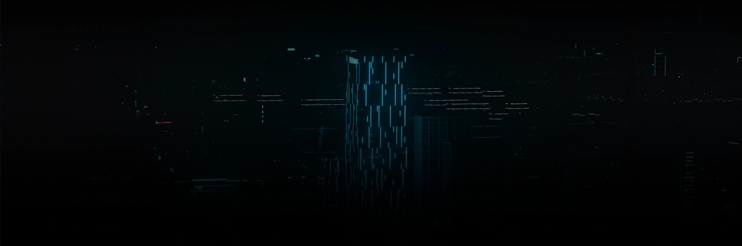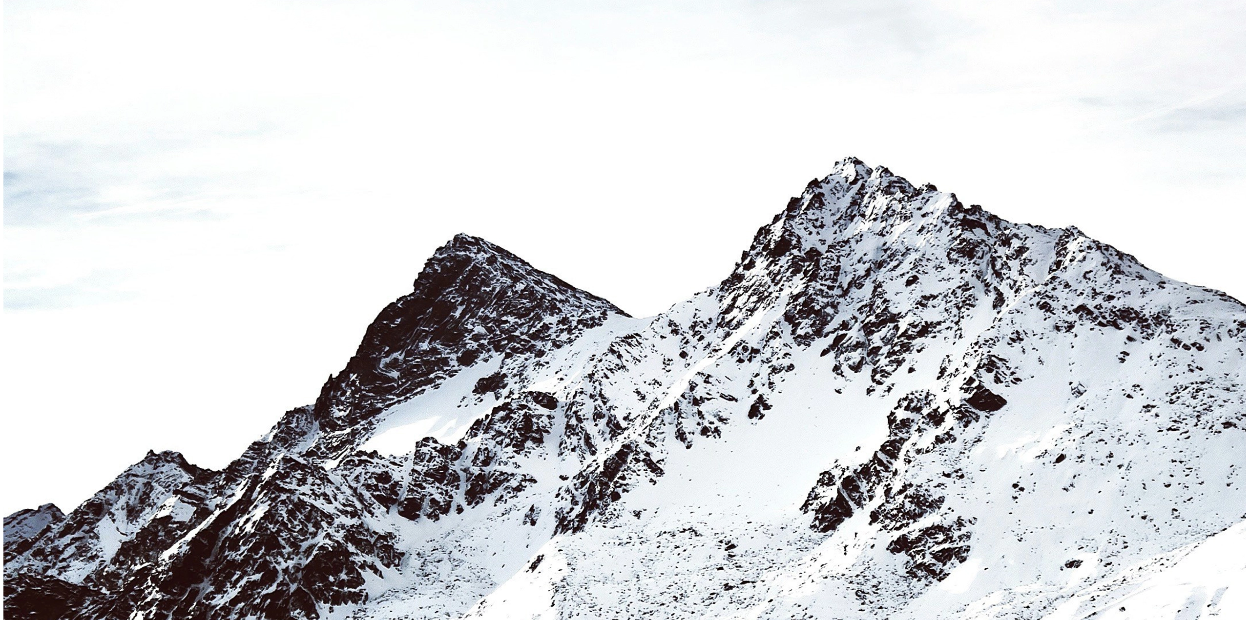
Tundra Security was a personal concept project created entirely in Figma. The focus was to design a modern cybersecurity landing page that felt trustworthy, minimal, and technically polished. I wanted to explore a visual direction that blended cold, high-altitude imagery with a clean interface to reflect strength, clarity, and protection.
The goal of the mockup was simply to practice UI layout, visual hierarchy, and creating a cohesive system across multiple sections without relying on heavy graphics or cluttered elements.
I started by building a cool-toned color palette and using subtle gradients to help the interface feel fresh and contemporary. Large atmospheric photography created an immediate sense of scale, while the UI elements stayed light and structured. Most of the work went into refining spacing, typography, and the balance between open white space and detailed content blocks.
Working in Figma allowed for quick iteration as I tested different layouts for hero sections, feature grids, and product explanations. The final result is a streamlined landing page concept that feels clean and consistent, built to showcase UI clarity rather than functionality.