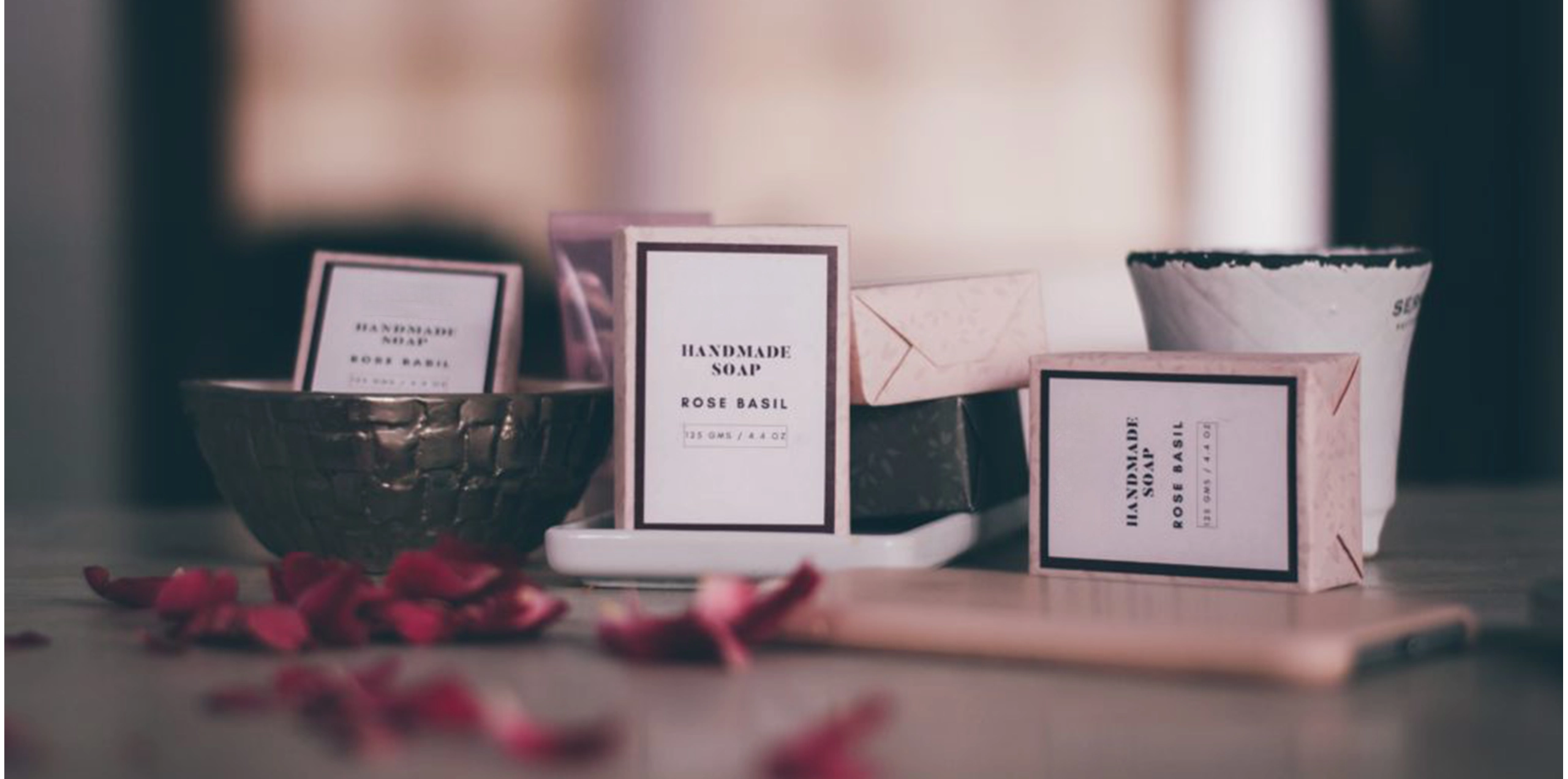
The Rose Collection Email Template was created as a conceptual UI design exercise for a mock beauty retailer. The objective was to design a clean and elegant email layout that prioritizes visual hierarchy, readability, and conversion focused structure. This project was not intended for development, but instead to showcase UI decision making in creating an email design.
The goal was to create a layout that feels premium while remaining user friendly. The design needed to clearly guide users from headline content to product discovery and CTA without overwhelming the user.
The layout was built using a strong vertical flow to reflect how users naturally scan emails. Clear spacing, controlled typography, and consistent grid alignment were used to reinforce structure and usability. Each section was treated as a modular UI block so the layout could easily adapt to different campaign needs.
Color, contrast, and button placement were all designed with interaction in mind. CTA’s are easy to find without disrupting the overall calm aesthetic. Even as a mockup, the design follows real email UI constraints such as single column structure, spacing for touch interaction, and clear product grouping for quick decision making.